New era, new uniform?
Celebrity Fixer Brandon Tierney came up with an interesting topic on Twitter and it was worth expanding. The ESPN Radio personality (and apparently he does something on SNY, but I don't watch SNY because they give me no love...LOL) talked about the Knick uniform and what fans would think about the idea of a change.
In fact, there is something to this. According to a source, the Knicks have had internal discussions about making some minor changes to the uniform for the 2010-11 season. It doesn't sound like anything major is being planned, just a subtle tweak and update. The NBA would have to approve and Adidas, the league's apparel outfitter, would also have to know with enough advanced warning.
Not that they don't already have a No. 6 jersey with a certain nameplate ready to hit the NBA Store in July. (I meant Patrick Ewing Jr., who did you think I was referring to?)
But what if the team ever decided to make a more dramatic change to the look?
Tierney argues that the franchise hasn't won any championships in 37 years so there really isn't any legit "tradition" to uphold when it comes to the look and logo. And he, along with some of you who re-tweeted him, agree that the jersey itself is kind of ugly.
Personally, I think it's the orange.
First of all, let's note that of the New York teams, those who wear orange-and-blue don't have a great tradition of success. The Mets (two World Championships, four World Series appearances and an endless resource of tabloid fodder) and Islanders (aside from four dyanstic seasons, more or less on par with the Nets as far as generating any real interest) are the other two teams.
Not exactly pristine company.
I think blue is clearly the way to go, so let's not change that. In fact, I believe the first order of business when it comes to next season is to have the Garden court return to the blue key area.
For those old enough to remember, the Garden IV floor had a blue painted area up until the 1995-96 season, when someone thought it would be cool to make it orange. Now, the Knicks were still a damn good team through 2000 with the orange paint, so you can't equate the downfall to that, but let's just say it's ugly and in the era of HD television, it's awful. So to the painters at MSG: go back to blue. It's classic and the Garden, even after the renovation, needs to be all about classic.
And maybe outline the white with black, so you have black-and-blue in the painted area. Perhaps that will serve as a reminder for Knick bigs to use their damn fouls rather than stand like doormen at the Ritz Carlton as opponents breeze on through to the rim.
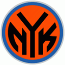
So now that we have the court back the way it should be, let's focus on the uniforms. The logo has always been corny. The ball and "Knicks" thing was updated in the 90s with block lettering and an upsidedown triangle to make it bolder. That's fine with me. Actually, I dig the "Subway Token" third brand of the black NYK in an orange circle.
But when it comes to the jersey, I think fans need to be wary of getting too caught up in changes. First of all, this one is obviously a huge no. As is this one, even on Christmas, St. Patrick's Day or the Feast of the Jolly Green Giant.
As for other changes in franchise history, the 1980s saw a different look, with the word "Knicks" below the number. I say to you, Fixers, that this here is the only way that jersey ever looked good.
Recall the abomination that was the Detroit Pistons uniforms in the 1990s? The teal and exhaust pipes? Dennis Rodman was rolling over in his grave. Or whatever tattoo/piercing table he was on at the time.
Remember when the Toronto Raptors had Barney on their uniforms? How about the era when the Jazz had the snowcap mountains on their jerseys? The Houston Rockets had a rocket?
No, no and no.
The words "New York" must remain across the chest, prominent and unpretentious. No Manhattan skyline, no Statue of Liberty (really, those Rangers Liberty jerseys only looked good on chicks) and certainly no Father Knickerbocker. (All apologies, Padre, but you look like Benjamin Franklin rolling a wagon wheel).
Today's jersey is orange lettering and numbering with blue outline. My suggestion is quite simple. The lettering is classic with a classic font. The orange, to me, is what's annoying.
In the early years, the lettering was blue. Eventually it was blue lettering with orange outlining. By the 70s the scheme was inverted.
[Seinfeld voice:] I mean what's with the orange?
So if we go back to the blue painted area on the court, let's go back to the blue lettering. Perhaps outline it in silver, just a hint. Or maybe outline it in orange, but only a little bit of orange. I mean barely enough orange to know it's orange. In other words, no orange.
Obviously on the road this could be an issue, because the road jersey is blue so how can you have lettering in blue if the uniform itself is blue. Here's how: make the lettering white or silver. Is that crazy? What, orange looks better?
These are subtle things, of course. LeBron James isn't going to come to the Knicks because they changed to better looking uniforms. From what we've seen with the Cavs, if LeBron does come to the Knicks, he'll have them wearing all kinds of color schemes. Maybe there will be a wine-and-gold Knicks jersey, so LeBron can honor his past.
(You know I couldn't resist).
I'd love to get your thoughts on this, be it here, at my Twitter account or on our world famous Knicks Fix Facebook page.


